Introduction Why Color Matters in Home Interiors
Color is one of the most powerful tools in interior design. It influences how a space feels, how large or small it appears, and how people emotionally respond to it. Even before furniture or decor is noticed, color sets the mood of a home.
In home interiors, color psychology plays a crucial role in shaping comfort, energy, focus, and rest. The right palette can make a room feel calm and inviting or vibrant and energising. When chosen thoughtfully, colors support the function of each space and enhance everyday living. This is why selecting the right color palette for home interior design is not just an aesthetic choice but an emotional and functional one.
Understanding Color Psychology The Basics
What Is Color Psychology in Interior Design
Color psychology studies how different colors affect human emotions and behaviour. In interiors, it helps designers choose shades that support how a room is meant to be used. For example, calming colors are ideal for bedrooms while energising tones work better in social areas.
Warm Versus Cool Color Temperature Impacts
Warm colors such as reds, yellows and oranges create a sense of warmth, energy and intimacy. Cool colors like blues greens and purples bring calmness, freshness and mental clarity. Balancing warm and cool tones helps create comfortable and visually pleasing spaces.
How Color Interacts with Light and Space
Natural and artificial lighting significantly affect how a color appears. A shade may look brighter in daylight and deeper under warm lighting. Lighter colors reflect light and make rooms feel more spacious while darker tones create depth and intimacy.
Cultural and Personal Preferences in Color Perception
Color perception is deeply personal and influenced by culture, lifestyle and memories. What feels calming to one person may feel dull to another. Good interior design balances color psychology principles with individual preferences.
Emotional Effects of Key Color Families
Neutrals Whites Beiges and Grays
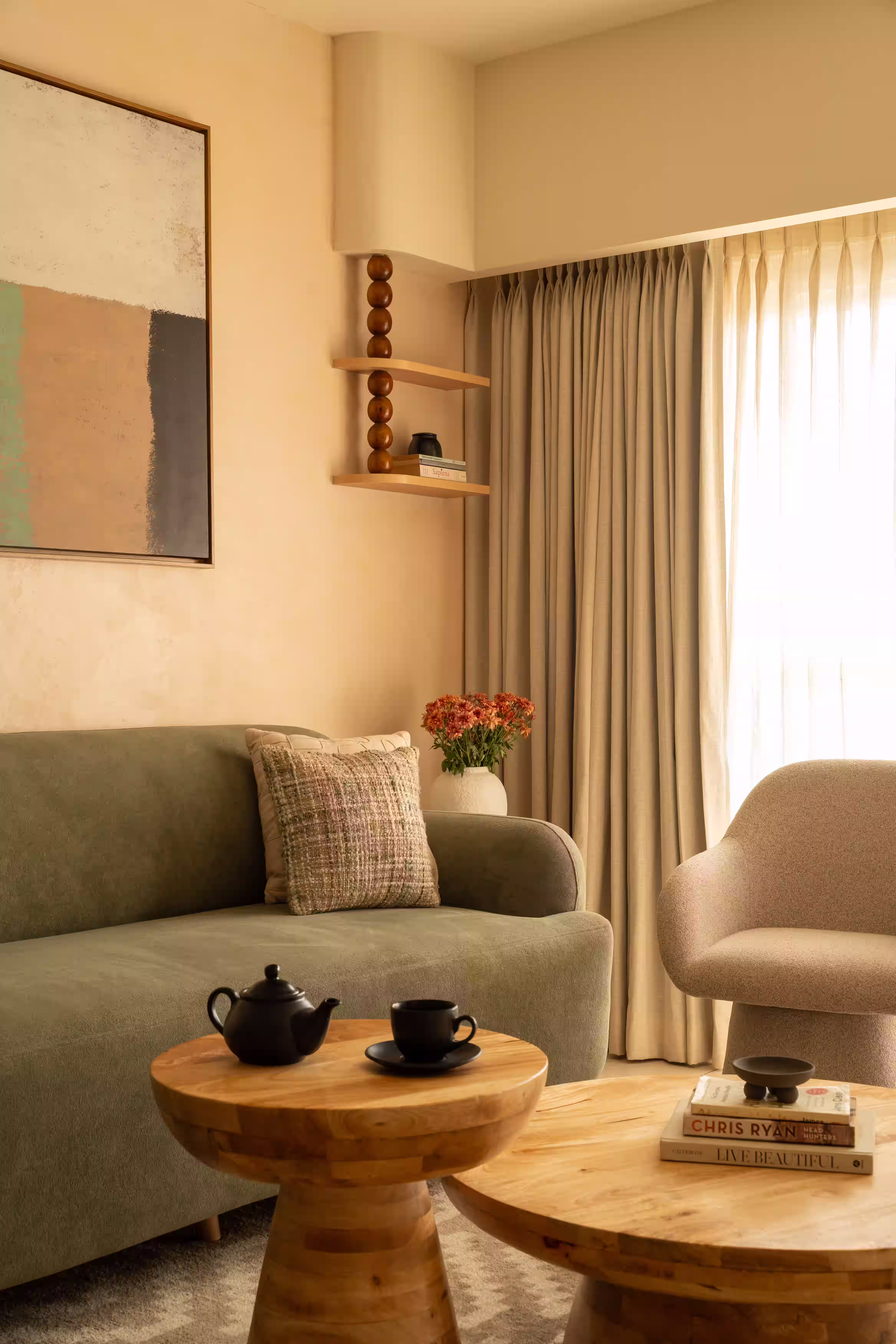
Neutrals create a calm and balanced foundation for interiors. They are versatile, timeless and easy to layer with textures and accents. Neutral palettes work well in living rooms, bedrooms and open plan homes where continuity is important.
Warm Colors Reds Oranges and Yellows
Warm colors stimulate conversation energy and appetite. They are often used in dining areas, kitchens and social spaces. Muted versions of these colors feel inviting without overwhelming the room.
Cool Colors Blues Greens and Purples
Cool colors promote relaxation, focus and serenity. Soft blues and greens are ideal for bedrooms, bathrooms and study spaces. These tones help reduce stress and create a peaceful atmosphere.
Accent Colors Pinks Teals and Mustard
Accent colors add personality and visual interest. Used in moderation through cushions artwork or feature walls they bring character without disturbing balance. Accent colors allow homeowners to express individuality.
How to Choose the Right Color Palette for Each Room
Living Room Palette Ideas and Psychology
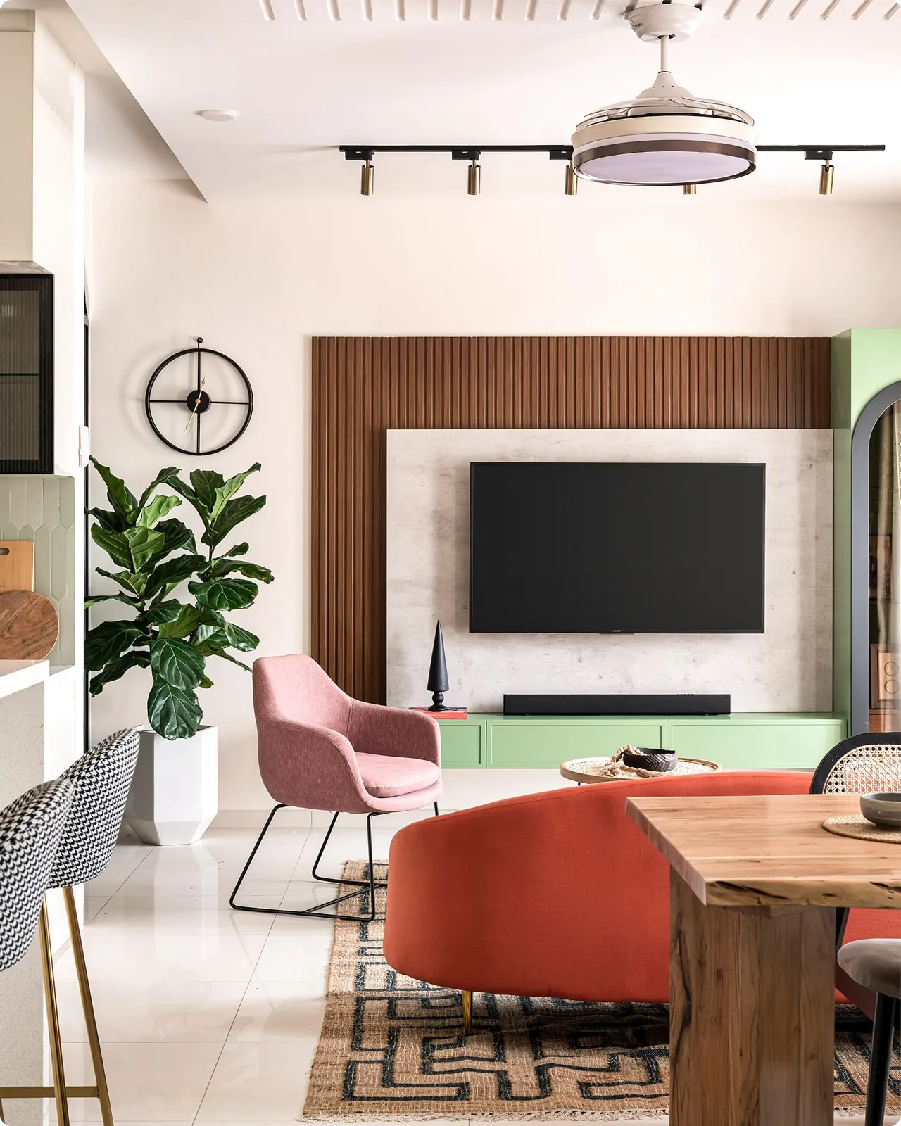
The living room is a social space where people gather and relax. Warm neutrals, soft greys and earthy tones create a welcoming environment. Accent colors can be introduced through decor to add vibrancy without overwhelming the space.
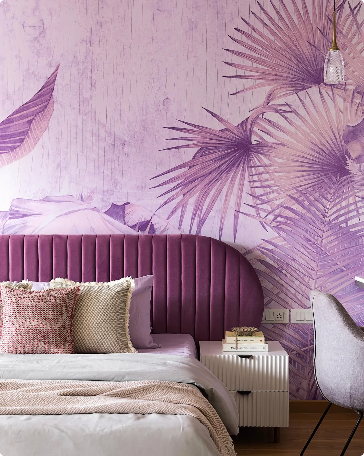
Bedroom Color Palette Ideas
Bedrooms benefit from soothing and restful hues. Soft pastels muted blues gentle greens and warm neutrals support relaxation and better sleep. Avoid overly bright or stimulating colors in sleeping areas.
Kitchen Color Psychology
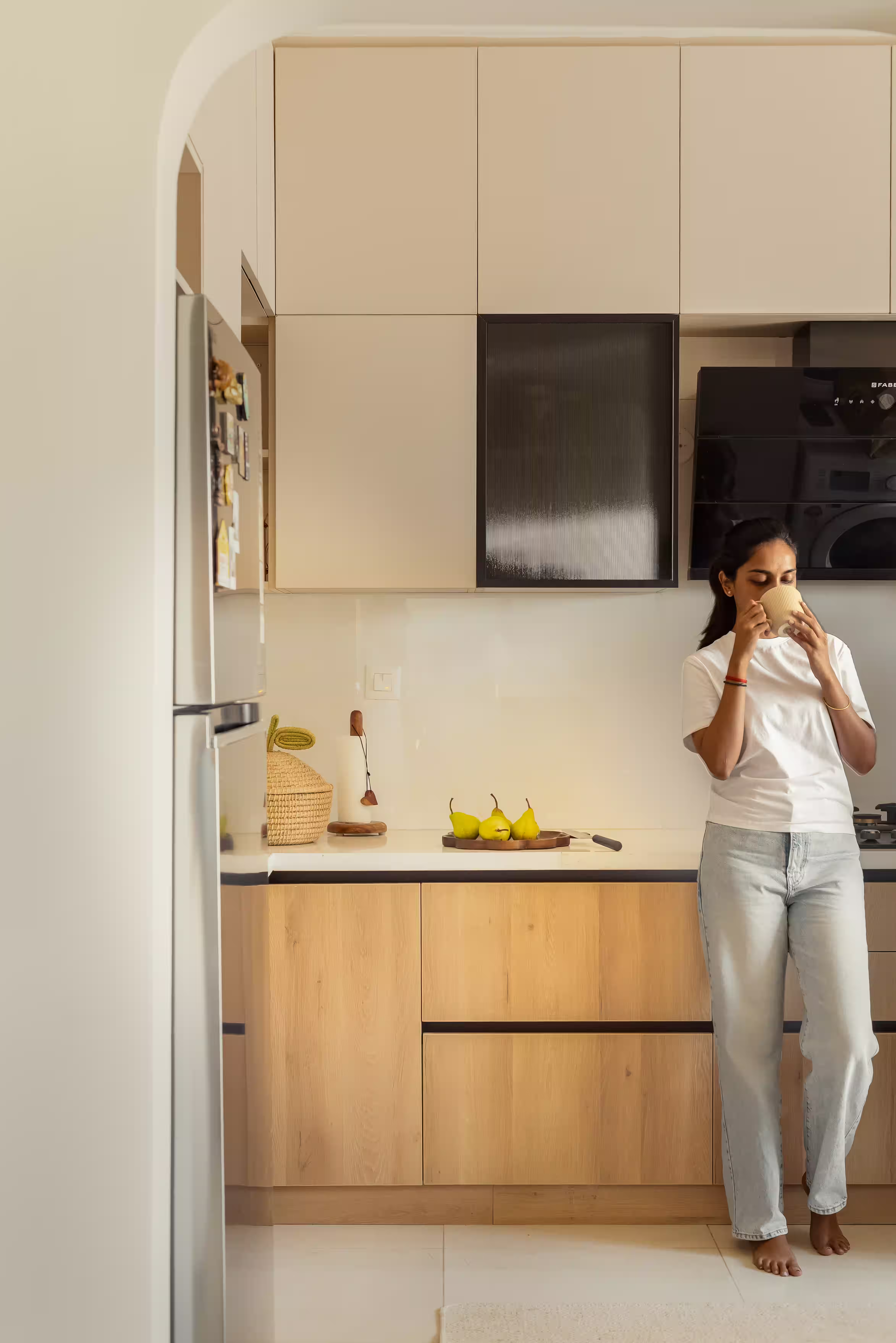
Kitchens thrive on energy and freshness. Light yellows, soft greens, whites and warm neutrals keep the space bright and inviting. These colors also help maintain a clean and lively feel.
Home Office and Study Room Color Ideas
Focus and clarity are essential in workspaces. Muted blues greens and neutral tones help reduce distraction and improve concentration. Balanced lighting enhances these effects.
Bathroom and Powder Room Colors
Bathrooms feel best with fresh and light colors. Whites pale greys soft blues and pastel greens create a clean and calming environment. Accent tiles can add interest without clutter.
Hallway and Transition Spaces
Hallways connect different areas of the home. Neutral and consistent color choices ensure smooth visual flow and continuity between rooms.
Color Scheme Strategies for Cohesive Interiors
Monochromatic Color Schemes
Using different shades of the same color creates a calm and elegant look. This approach works well in minimalist and modern interiors.
Analogous Color Schemes
Analogous schemes use colors that sit next to each other on the color wheel. These palettes feel harmonious and easy on the eyes.
Complementary Color Schemes
Complementary colors sit opposite each other and create contrast. When balanced carefully they add vibrancy without visual chaos.
Triadic and Tetradic Approaches
These schemes use three or four colors and require careful planning. They work best when one color dominates and others support it subtly.
When to Use Statement Accent Walls
Accent walls work well to highlight architectural features or add depth. They should be used sparingly and balanced with neutral surroundings.
Common Color Mistakes to Avoid
- Using harsh contrasts without balance can overwhelm a room.
- Adding too many bold colors in small spaces makes them feel cluttered.
- Ignoring furniture and decor while selecting wall colors leads to mismatch.
- Misjudging lighting conditions can alter how colors appear.
- Overusing trendy colors without considering longevity may require frequent updates.
Role of Luxury Interior Designers in Choosing Your Color Palette
Luxury interior designers bring expertise and clarity to color selection. They understand how colors interact with materials, lighting and space. Through mood boards and three dimensional visualisations designers help clients make confident decisions before execution.
Designers also consider lifestyle personality and daily routines when creating palettes. With local expertise luxury interior designers in Bangalore understand climate lighting and apartment layouts which helps create timeless and harmonious interiors.
Book a palette consultation with Tesor Designs to create a home that feels balanced, elegant and personal.
Color as a Tool for Mood and Atmosphere
Color shapes how a home feels and functions. When used intentionally it supports emotional comfort and daily activities. A thoughtful color palette enhances both beauty and wellbeing. Choosing colors with purpose allows every room to tell a cohesive and meaningful story while creating interiors that truly feel like home.
FAQ
- Which colors make a bedroom relaxing?
Soft blues muted greens, warm neutrals and gentle pastels promote rest and calmness.
- What colors are best for boosting focus in a home office?
Muted blues greens and balanced neutrals support concentration and mental clarity.
- How does lighting affect wall color appearance?
Lighting changes how a color reflects and absorbs light making it appear lighter, warmer or deeper.
- Are warm colors good for all rooms?
Warm colors work well in social spaces but should be used carefully in bedrooms and small rooms.
- Can a color palette impact my mood?
Yes colors directly influence emotions, energy levels and comfort within a space.
- How can I test colors before painting the entire room?
Use sample patches, observe them at different times of day and view them under both natural and artificial lighting.